Expo West is a lot to take in. Three days, thousands of brands, and more samples than you can carry. But a few packaging moments cut through the chaos — here's what caught our eye.
Sourcing packaging for your next launch?
Browse packaging components on Impacked →
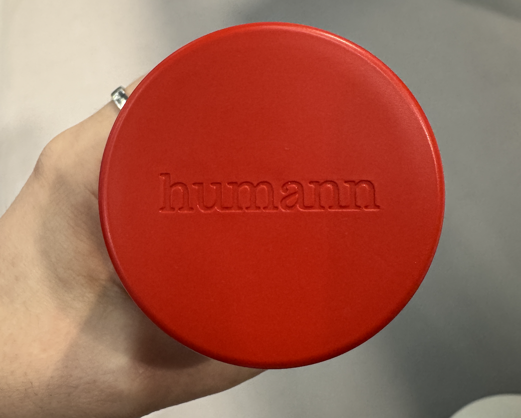
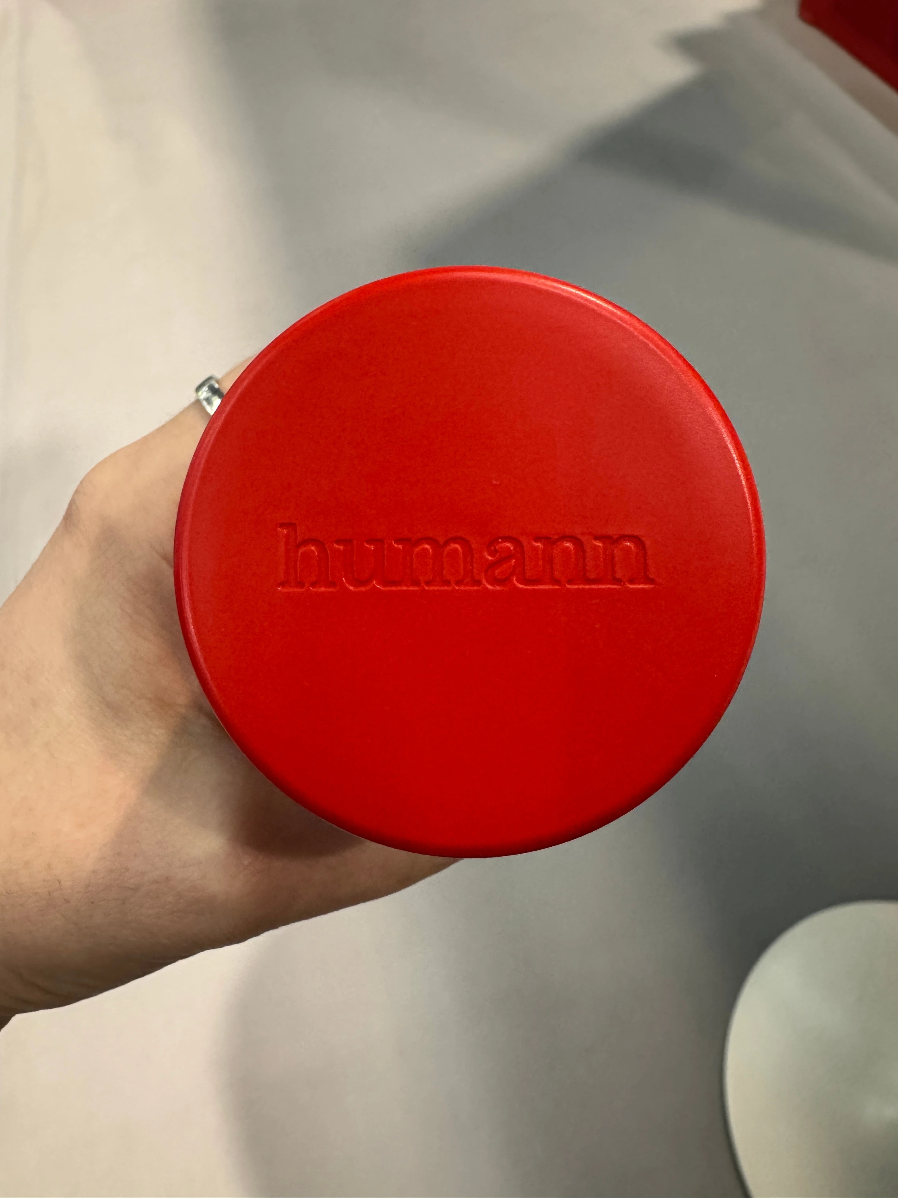
Humann's Rebrand: Red as a System, Not an Accent
Humann showed up to Expo West with a full packaging refresh — and it landed.
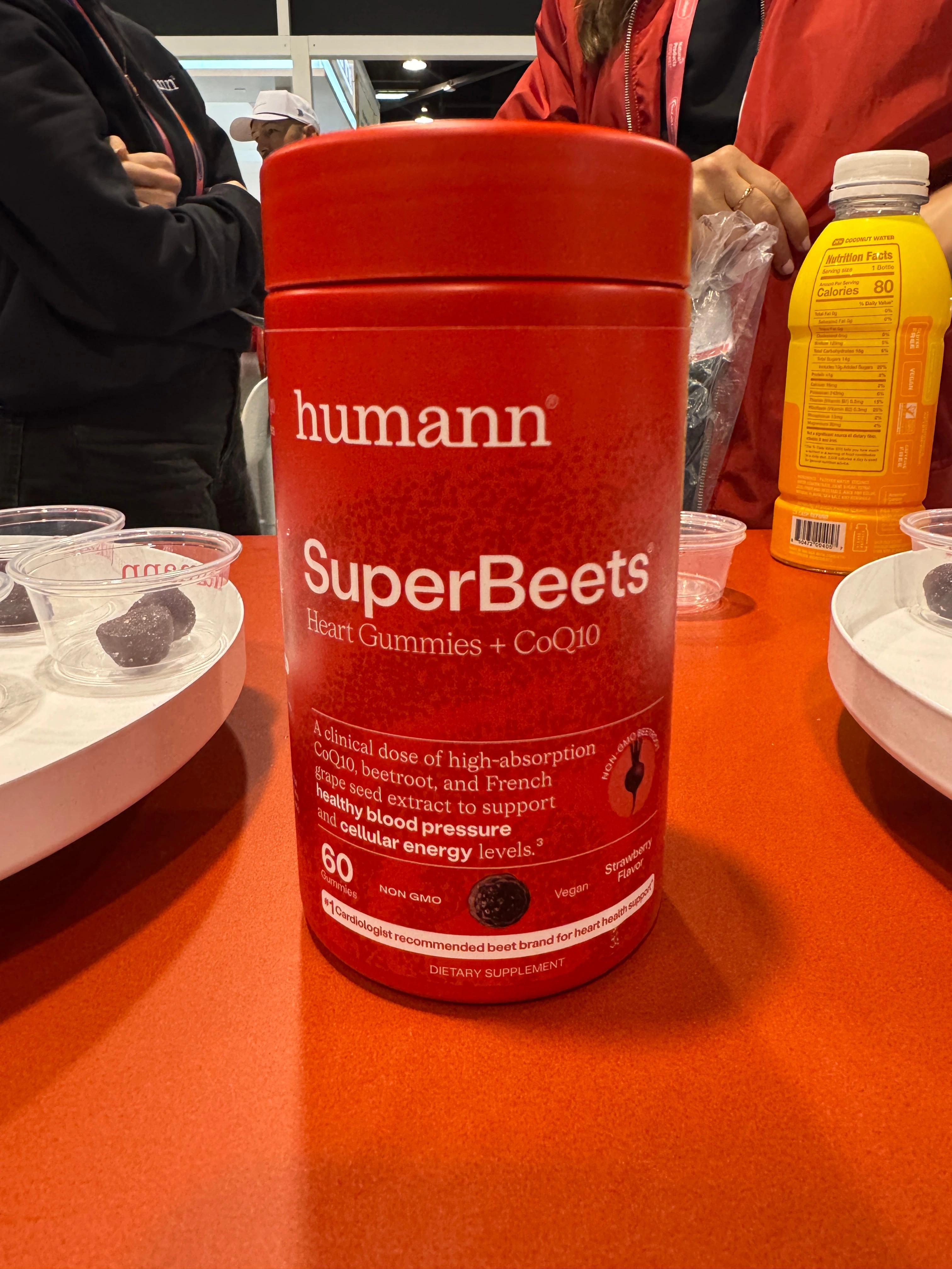
The old look was white-forward with red as an accent. The new look flips it. Red is now the main character, cuing heart health at a glance across the entire range. The change is deliberate: Humann isn't just a supplement brand anymore. They've built out a Modern Cardiovascular Health Game Plan™ covering three daily products targeting cholesterol, metabolic, and cardiovascular health. The packaging now reflects that system-level positioning with clarity.
These are labelled rigid containers, not direct-printed. Brands often treat direct print as the only path to a bold, cohesive look. Humann proves otherwise. The debossed logo on the Cholesterol and Metabolic Health Dailys adds tactile weight without complexity. Nothing was over-engineered.
The formula didn't change. The credibility cues didn't change. Only the hierarchy did, and that's what made it work.
Kiima: Refillable Lip Balm, No Plastic Pod Required
We covered Kiima's refillable lip balm earlier this year. Seeing it in person is a different experience.
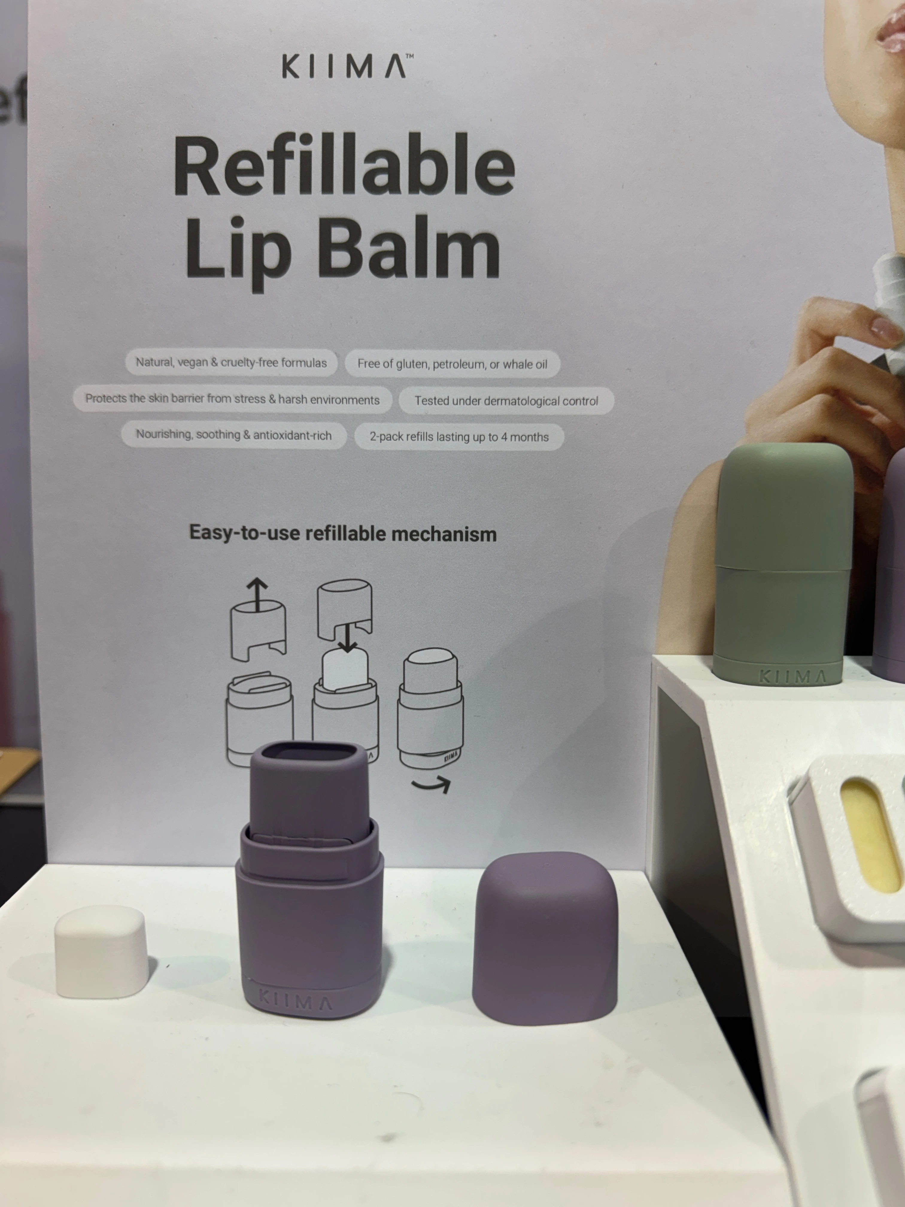
Most refillable packaging formats rely on a rigid pod, a small plastic insert that clicks in and ships separately. Kiima eliminated it. The refill is just the solid product itself, shipped in a paper box. The applicator holds the formula directly. By removing the intermediary component, Kiima reduced the packaging footprint without sacrificing the refill mechanism.
At $10, it's accessible. In four colorways, it's designed to be chosen, not just purchased. For brands thinking about refillables below the 50ml threshold, this is the execution to watch.
Trip x Calm: Packaging That Earns Its Second Ingredient
This collaboration has been running for a couple of years now. The fact that it's still on shelf tells you it's working.
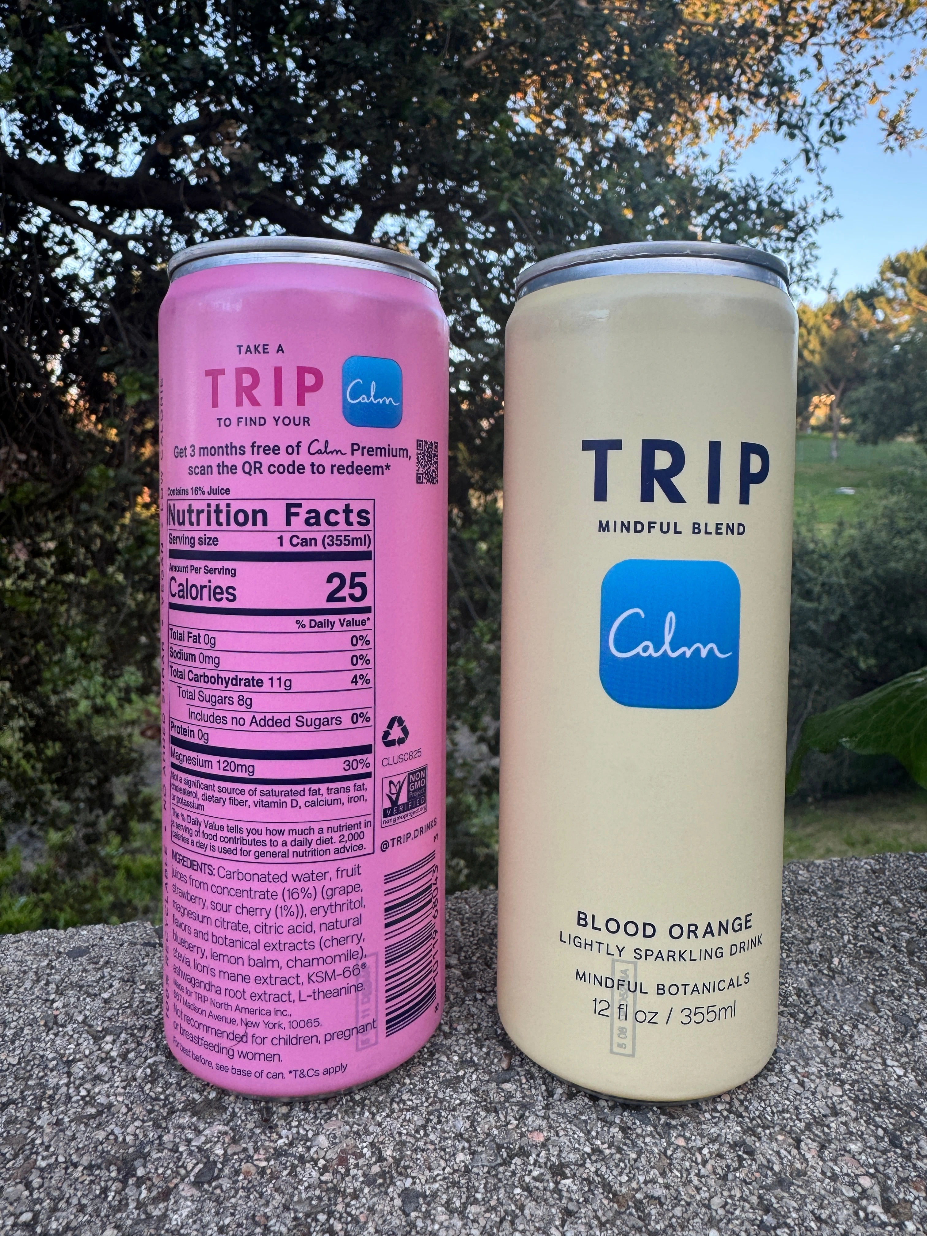
Trip's Mindful Blend features the Calm logo front and center and a QR code on the back linking to a free 3-month Calm Premium membership. It's a clean example of co-branding done without dilution. Both identities are legible, the value exchange is clear, and the QR code isn't decorative. It drives a real conversion.
Smart packaging can expand the real estate for communicating with the consumer beyond the pack. This one uses that space to also drive subscription acquisition.
Madley Hadley: Color as a Category Signal
Parmesan doesn't have a design language. Madley Hadley is building one.
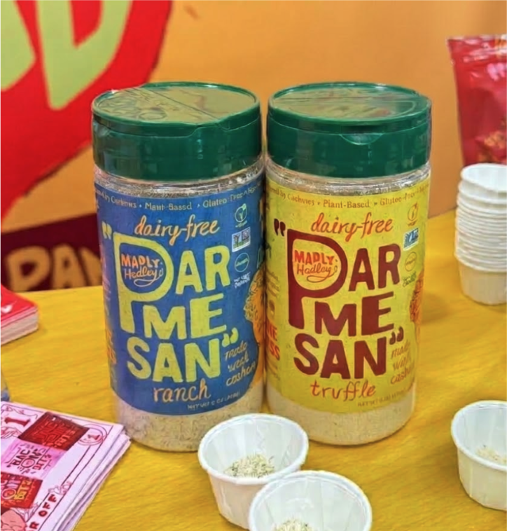
This is dairy-free parmesan in a category dominated by the real thing. The format is standard: a dual-hinged flip top cap on an 8oz PET container. What's not standard is the color palette. New variants debuted at Expo West bring real visual differentiation to a shelf that's been a little blah since the beginning. Bold color signals difference before anyone reads the label.
The form works. The color is doing the job the brand story can't do from the shelf.
Biom: Rethinking The Disinfecting Wipe
Biom launched Disinfecting Wipes at Expo West, and the packaging story is the lead.
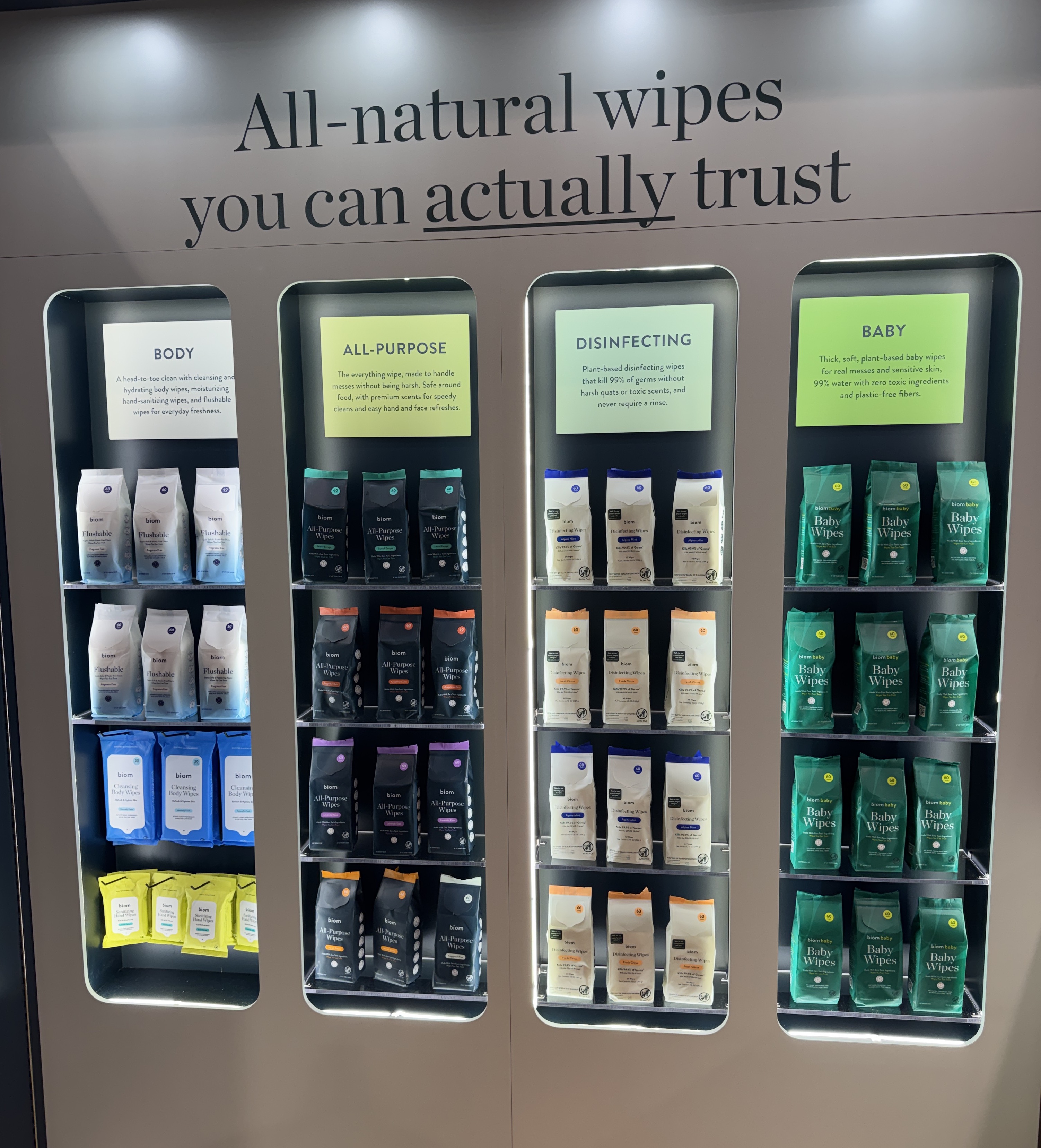
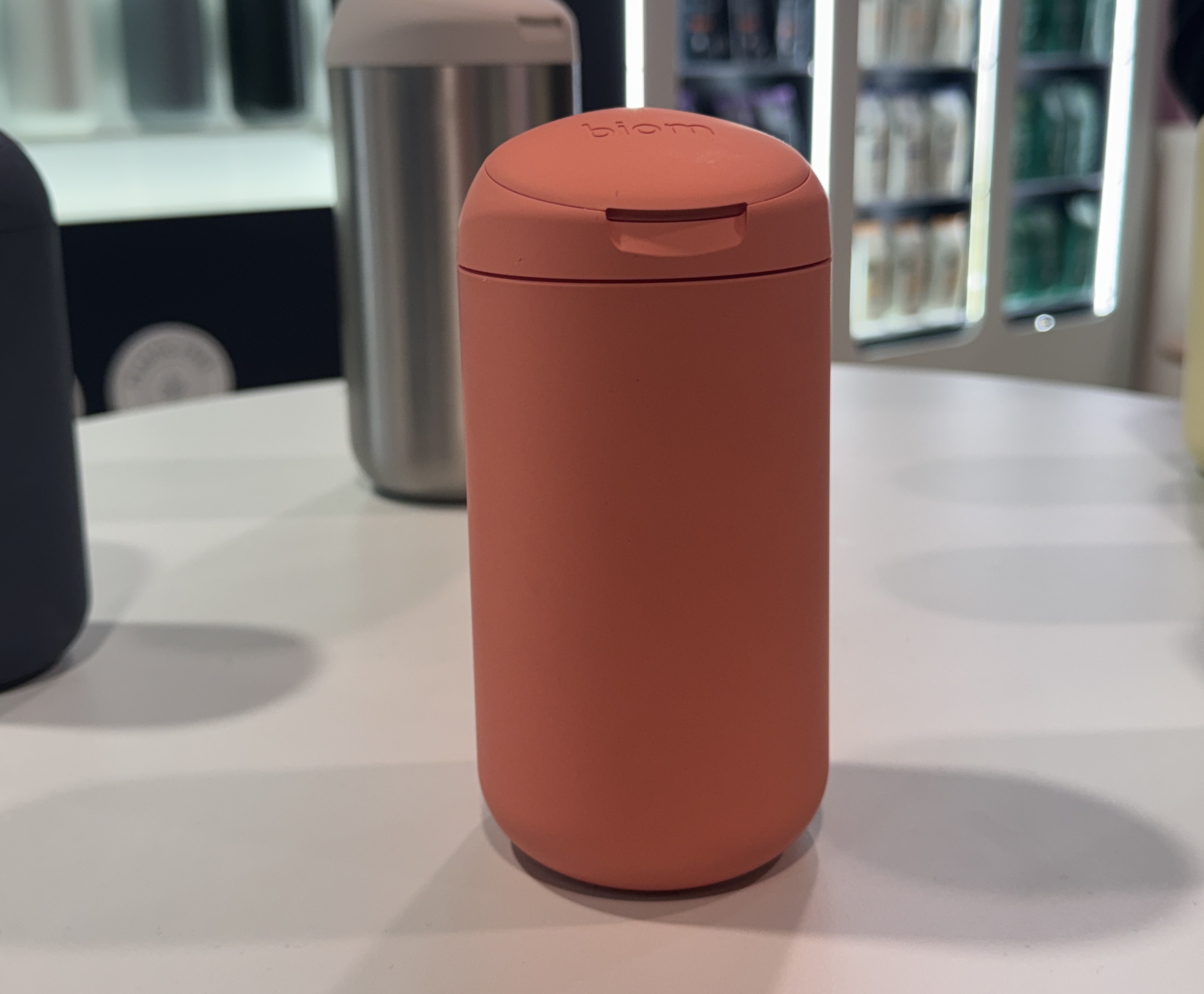
The conventional disinfecting canister is bulky, plasticky, and designed to be hidden. Biom's approach: ditch the canister entirely. Their Disinfecting Wipes ship in flexible film packaging, which cuts plastic waste by 90% relative to the standard format. The wipes load directly into Biom's existing refillable dispenser, the same award-winning design already in their all-purpose and hand sanitizing lines.
The formula is also a category break. Quat-free, plant-based fibers, EPA Safer Choice approved, powered by citric acid. It's the first disinfecting wipe at mass retail that kills 99.9% of germs without quats or plastic fibers. The packaging decision is what makes the launch coherent: flexible film as the refill format keeps the dispenser as the permanent object on the counter, and the wipes as the consumable. That's a subscription model built into the design.
Five very different products. One consistent thread: the packaging is doing real work — building brand equity, enabling refill models, signaling category leadership from the shelf. The brands that understand this aren't just winning on design. They're winning the shelf.
See something worth sourcing? Let's talk.